In preparation for my painting session today, I had previously painted a faint, or weak in color, acrylic painting of a waterpot. This technique suffices as a light sketch. In my studio, before I did anything else this morning, I created some valuable value scales of each of the colors on my painting.
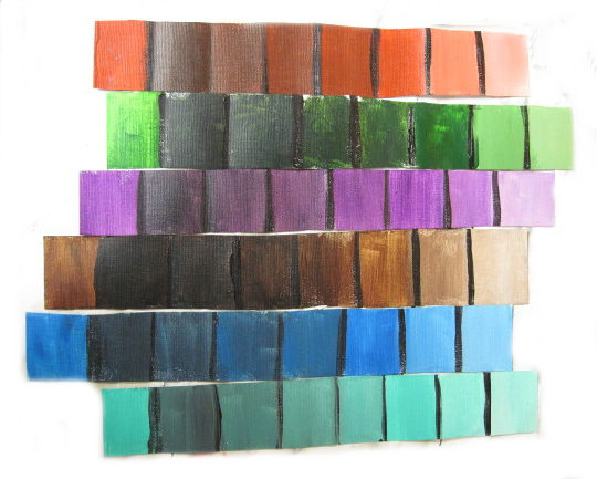
The value scale reads from left to right, starting at the left square.
Original color, darkest value 5, value 4, value 3, value 2, value 1 (original color), the right two squares are original color plus white. I am not showing the viewer these value scales to win any awards for photography. I know this photo is not picture perfect, but it is to achieve the real purpose, which asks the question, “Why do I create value scales?”
Value scales are important tools of information for any painting medium. I have artist friends who never use value scales and are extremely happy painting. However, the artists that do employ the use of value scales in their paintings have a greater concept of contrast and engage the effects of different values directly in their paintings.
What effects? The famous artist John Salminen says that when using the value scale, one creates a movement in the art piece. Movement is one effect. Also with a value scale in place, one can integrate darks into middle and light values and avoid the dreaded bull’s eye effect, another effect. In addition, it is important to use value scales to enhance the push-pull method, which is using values as the median ruler to determine what locations exist for the best possible design. Darks recede; lights come forward.
I highlighted just a portion of my painting for demonstration purposes. When I finish this whole painting, I will display “The Waterpot” in my website gallery.
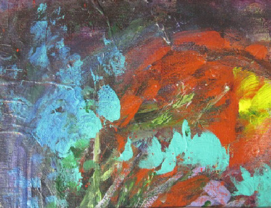
I began in the upper left portion and began applying paint according to the values that I observe in each color. Although I mixed colors in the light sketch beforehand, I avoid mixing at this point and stay true to my value scales.
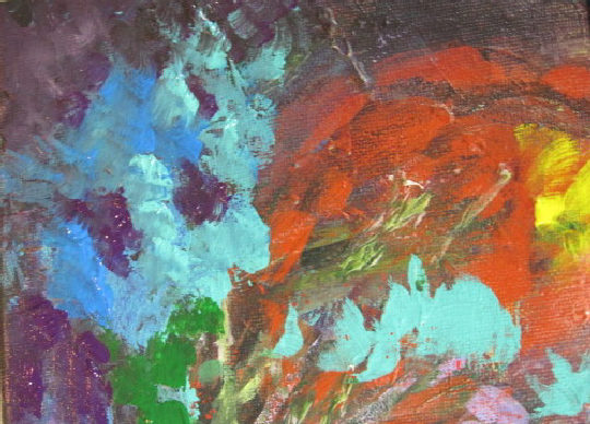
As you can see, the upper corner is becoming more vibrant and alive. I continued until this whole portion was painted.
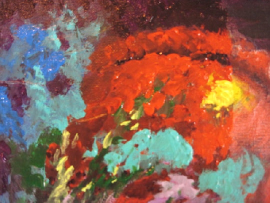
For me, it is EXCITING and vibrant! Using value scales is an important artistic tool. Perhaps in using them, you too will find excitement as I have in rediscovering the blessing of values God has created around us. With my vision restored, I now see depth, movement, and such wonders again.
God is indeed good. I praise His Name forever for giving us such beauty!