Framing for watercolor paintings and acrylic paintings are as different as night and day. For my watercolor artwork, I usually stayed with a white or off-white mat and a simple metal frame, because of the many art contests’ requirements.
For example, the Iowa Watercolor Society specifies such mats and recommends a simple frame for its annual show. Their reasoning was that the artwork should stand on its own merits when judged. This makes sense if one is entering the artwork in art shows.
However, in the case of acrylic paintings, there’s a freedom that engulfs choosing different frames. It is fun to see what effect each frame has on one’s artwork.
For example, here is my recent artwork “Eruption in the Nth Degree” in a basic black frame.
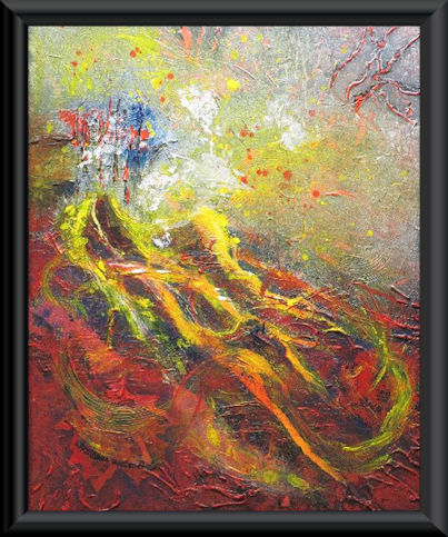

Is the frame taking the emphasis or focus away from the artwork?
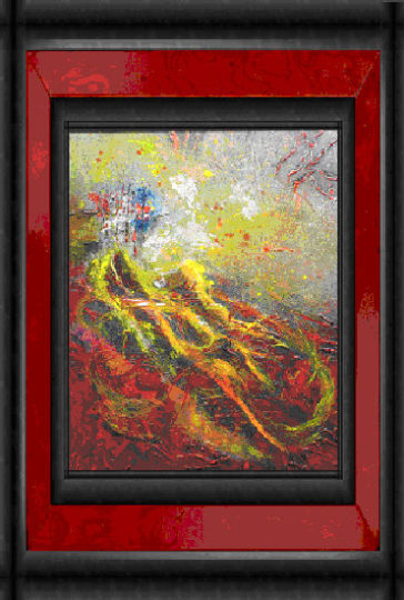
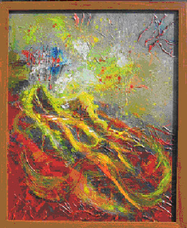
Let us try a mahogany frame.

The browns are accenting the yellows.
If a classic gold frame is added to the artwork,
will it enhance or subtract its intensity?
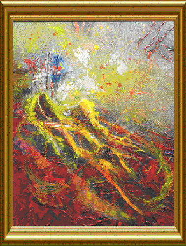
The classic gold frame offers an interesting choice.
It brings out the yellow hues.
Let us try some wild frames, such as the burl wood frame.
Does the red-toned wood overpower the painting or enhance?
I like how it draws out the reds.
Here is a marble frame.
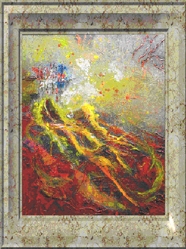
Hmmm, interesting.
Here is a simple oak wood frame.
This photo of the artwork taken outside with the direct sun and shadows depicts a smaller frame. Its frame is actually larger, but the color association is still there.
A frame should enhance the painting.
If the correct frame is chosen, there is vibrancy
and a partnership between the painting and the frame.
May you find that perfect frame for your artwork.