– if very little color mixing.
2) Reflected color of objects near-by.
Principle 3 : Principle of Simultaneous Contrast
I became more aware of the importance of the Principle of Simultaneous Contrast in every day life, when my son and I were in a department store to buy him some slacks. In the men’s dept, on the wall were hanging racks of slacks with the same design but different colors.
I had been studying Chevreul’s work, so the words popped out of my mouth: “The wheat golds are the same color. It’s Chevreul’s Contrast and Harmony of Colors.” To his chagrin, I proceeded to tell him about Chevreul’s Principle of Simultaneous Contrast; thus the first rack of wheat gold appears darker than rack two. Whereas rack two of wheat gold appeared lighter when placed near the dark olive green rack. What do you think he did next? Yes, he exchanged the two front wheat gold slacks to prove me wrong.
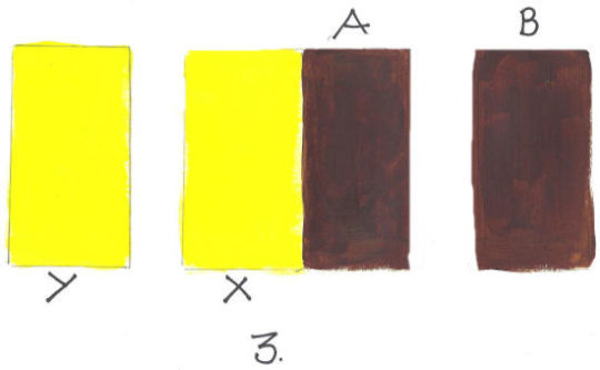
One more note to take into consideration when using this principle: Robert Delaunay described this retinal action set off by vivid colors. It is the juxtaposition, or push-pull effect, at another level that creates a sense of mobility. In the photo above, the brown pushes back. The warm/light colors come forward and the darks/cool colors recede.
Principle 4: Principle of Successive Contrast
Due to contrast level or great difference in values of each of the colors (yellow and blue), the white square Y appears to be brighter in the blue than the white square X in the yellow.
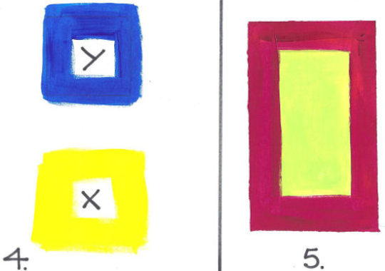
Principle 5: Principle of Complementary Contrast
Complementaries or colors opposite on the color wheel, when placed around or touching together, the colors appear more brilliant. Another word for it is “Color Relationships” or how the colors relate to each other. This example is yellow-green and red violet.
Side by side, the yellow-green is stronger because it is next to its complement and seems to have a “pop out” effect.